6 Ways You Can Improve Your Magic Website TODAY
October 29th, 2016 by Jonah Babins
booking, business, socialmedia, websites
If you currently have a magic website and you’re looking to make it as great as possible, here are some tips that are going to help you maximize the effectiveness of your website.
I really hope you like it!
If you haven’t yet download our “Make Your Own Magic Website” checklist if you want to make sure you’re not missing anything critical on your site!

Get the checklist when you subscribe to our newsletter! Trust me the newsletter is the best part!
1. PURPOSEFUL HOMEPAGE
First impressions matter. Your home page needs to be pretty, clean and easy to navigate…but you probably know that already.
What needs to be mentioned is the call to action on the homepage!
When people arrive at your website, they’re ready to follow your instruction. They don’t know what your website has to offer, you have to walk them through it.
Put yourself in the mind of your potential buyer.
My advice is since the whole purpose of the website is to get booked there should be an obvious button, link, or call to action for them to start booking you!
If for some reason you think it’s critical that your potential clients take a different action like checking out your videos, or something of that sort, then that’s what your homepage should do.
For me, I know since I’m not paying for ads, most people are coming to my site because I or someone else sent them the link, which means odds are they’re either ready to buy, or browsing around for interest.
The worst thing you can do is have a homepage with no buttons on it.
Then you just hope that they’re going to pick a tab in the menu that they see fit and randomly explore, or worse they might leave your website all together.
Think of your website as a guided journey between you an your potential buyer, not a choose your own adventure game.
Your home page is everyones first step to the journey. Decide what direction you want them to go in. Where the first place is that you want them to go on your website and put it on your homepage!
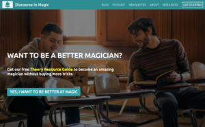
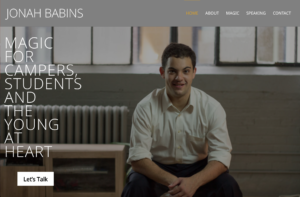
For example here are the two calls to actions for two website that I have:
Check out This Article on Hubspot for examples on what good calls to action look like, and how you can make them!
2. Mobile Friendly
Mobile is here. Before I start showing you statistics, think about how much you’ve used your phone this year, and compare it to how much you used it 3 years ago.
If you’re like me, even though you spend most of your day working on your computer, it’s still probably likely that you spend more of your day on your phone then you do your computer.
Unless you still have a blackberry (Hi Dad + Morgan Pierce), there’s probably very little that you exclusively do on desktop.
It’s true for everyone else too! Which means the odds of you getting discovered from someone’s mobile browsing is going up and up every day!
If you have a website and it’s 2016 or later it needs to be mobile friendly!
Don’t believe me?
Heres some stats that might sway you
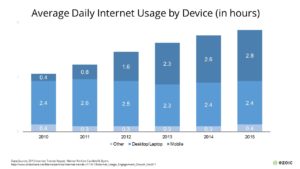
As of last year, people are browsing the internet more with their phone then they are with their computer!
People are browsing your website on their phone!
Thus (that’s right I used the word thus) it needs to be mobile friendly!
Need another reason?
As of April 21st 2015 whether or not you show up on google when mobile searched might have a lot to do with if your site is mobile friendly.
Read more about it from google here
Do it. There are 1000 ways to have a mobile friendly website. It’s super important!
For Discourse in Magic 47% of our total website traffic is mobile!
Could you imagine how many of you we would lose if our website wasn’t so mobile friendly!
3. Contact Form/Details Everywhere
The point of your site is to get someone to reach out to you through either your contact form, or your email or your phone number. Don’t make that really hard to find. I try to plaster it all over!
If you have a one page only site and you put contact at the bottom, find some way to make it obvious at the top, people might not scroll all the way through!
If you have multiple pages, I recommend contact information on every page. Maybe on the page itself, maybe on the footer, maybe the header, but people need to know where to contact you. They shouldn’t have to look around, and possibly get lost.
Ps. If you put your email on the page for people to email you, please don’t have an email from middle school for example jonahbabins1234sexymagicman @ hotmail.com.
Go with something more professional
If you can get one with your url in it, that’s great! But if you need to create a gmail address that’s fine too. Just make it professional sounding.
4. Social Media
Assuming your active on social media (If you aren’t you should read our Social Media Guide), linking to it from your website is a great idea!
Especially if you have content on those platforms. You should be able to be proud, or moderately proud of your social media so that people can see it and it can act as another piece of social proof that you do magic and you’re good at what you do.
Is it necessary? Probably. But maybe not. But I think every day it becomes more and more of a tool and asset to reach people other than paying for ads. Plus, the earlier that we take advantage of it, the better chance we’re going to have the size audiences that we need when it becomes necessary.
It doesn’t need to be anything crazy. But I totally think you NEED a youtube demo video of sorts! Or another way to prove that you do what you do regularly: Instagram and Facebook come to mind too
If this sounds overwhelming start with 1 social media platform.
Start making some great content, and make sure you link to it from your site!
If that sounds overwhelming check out our social media guide, and download it so you have it whenever!
5. The Testimonial/Client Page Dilemma
Should you or should you not have a testimonial/past clients page?
Well lets start at the beginning
You need testimonials on your site and you need people to see them.
Whether or not you have a testimonial page, you need either quotes, videos, or faces that say how great you are around the rest of the site.
We’re trying to incept our visitors!
This is critical to having a good website. Remember, the point of the site is to make people want to book you.
It’s important that they see testimonials even if they don’t think they want to see testimonials. You’re trying to land a great first impression!
So, you’re welcome to have a testimonials page, because honestly it’s impressive to have a page full of people telling you they valued what you did! Just don’t do it at the expense of testimonials elsewhere on the site.
They’re one of the most important things to have. If you can sprinkle them around your website, and have a ton more for your page, it might be worth your time. Otherwise, just make sure your site is full of them!
A testimonials/clients page is good if you have a ton. If you don’t, I would probably leave it out and opt to sprinkle what you have all over the site.
6. Elicit Emotions
The way a potential buyer feels when they’re on your website plays a huge part in whether or not they want to book you.
Issue is, it’s more art then science. Try to focus on how you feel when you’re browsing it. The feeling of a site that’s high end for corporate events is different than one that’s for kids.
Here’s an exercise that might help: Come up with 3 or 4 adjectives that you want your site to exemplify.
For my website I used: Human, Creative, Fun, Social, simple
Now look for colours, fonts, styles and photos that you think help represent and illicit that emotion.
Another way to do it is to find 5 or 10 performers who you feel you’re similar to in the field and look at their websites. Check out their colouring, fonts, style, photos, and actual text.
Without copying them, try to understand the essence of what they’re doing. But make sure your focusing on the ones that are getting booked.
Now you can implement and test approaches that your peers and role models use to see if it’s for you!
Here are the 10 websites that I used for inspiration for my own website:
Gary Vanerchuck, Keith Brown, Bobby Motta, Smart Passive Income, Discourse in Magic, Eric Leclerec, Chris Mayhew, Joshua Jay, Videofruit, Nathan Barry,
Many of these websites are magicians. But I also look at successful online marketers and entrepreneurs since I know they have the money to spend to split testing the front pages and different styles that I don’t. Best to just take some advice from the pros.
Here are some ideas I borrowed from the sites that I like and incorporated in mine:
Gary Vaynerchuck – Social Media Panel
Chris Mayhew – Buyers Journey
Keith Brown – Beautifully photos focused
Smart Passive Income – First Person Writing Style
Nathan Barry – A or B option
VideoFruit – Look of homepage photo + call to action
Bobby Motta – Photos that are telling of projected personally style
Discourse in Magic – Header photo
Joshua Jay – I guess nothing, but it’s beautiful to look at
Eric Leclerec – White compelling words on dark photos
And for comparison here’s my site: www.jonahbabins.com
If you haven’t yet Download our “Make Your Own Magic Website” checklist if you want to make sure you’re not missing anything critical on your site!
Get the checklist when you subscribe to our newsletter! Trust me the newsletter is the best part!